What's new

Rebrand announcement coming next week

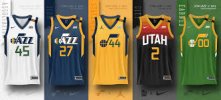
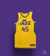
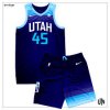
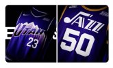
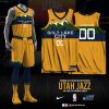
These aren't great but it probably took you a day or two and they are still tons better overall than the official ones. These felt too Kings-y to me

They'd be better if they went with black and white + the mountains, I guess. They remind me too much of the dang Kings and we're no Kings, even if our franchise is destined for a similar collapse.
 
FVeUrvLX0AAQn4L
 
Here's a controversial opinion - I don't even love the mountain jerseys. I know they have sentimental value from the Finals teams... but IMO those jerseys suffer with identity crisis of their own. Mountains + Jazz, weird hue of muted bluish purple. It never quite clicked with me. Not at the time, not when they were reintroduced a few years ago, and not now.

Now don't get me wrong - I prefer them a 1000 times out of a 1000 over that white-black-highlighter yellow monstrosity... but yah... oh well...
 
Ok. It’s a cold Saturday night. I’ve just been to an awesome even at a winery and I’m drunk ad. And these jerseys sucks thb sweat off a dead man’s ballzzzzz
 
Ryan, and probably Wade, are basically saying they’re the smartest people in the room. Either they a) simply don’t care what Jazz fans think or b) they think fans will come around because everyone is too stupid to understand right now. It seems a bit detached from reality and does not give warm fuzzies about the potential overlap with basketball decision making.
Dwade’s Instagram post backs up theory b 100%

773388F6-930E-4912-A9B0-98849A10CF84.png
 
For real. A modernized mountain theme would have been

Sent from my SM-A326U using JazzFanz mobile app
Damn near anything other than the Pistons Knight piece jerseys or the Raptors Barney jerseys would have been better than this extremely lazy effort.

I'm still stunned that this effort is what made it passed an Executive team. It's ****ing astonishing. My company sells scrubs (ie medical apparel), and more basic stuff than this gets blasted and reworked over and over. And we aren't selling stuff that will be on national television representing a billion dollar brand.

I sure hope that billionaire ******* spent a bunch of money to make all the retired jerseys in the arena look stupid to match. As much as I hated every change the millers made I gotta admit they were all way better than this rubbish.


Sent from my iPhone using Tapatalk


Ryan Smith hit a new low with the 3 new jersey they came out with. I’m posting these images jersey which I really like and of course the original Jazz jersey I loved from Karl Malone days. And the throw back of the New Orleans Jazz logo which that one is coming out during the 2023/24 season
 

Attachments

  • 9E08BAC5-B71C-49AD-9EFA-9481035828A2.jpeg
    9E08BAC5-B71C-49AD-9EFA-9481035828A2.jpeg
    22.3 KB · Views: 21
  • ED165210-A930-4395-B094-2FAEDD501FEB.jpeg
    ED165210-A930-4395-B094-2FAEDD501FEB.jpeg
    12.7 KB · Views: 20
  • A4D8829B-A12D-49D3-BCFF-797EB82CB174.jpeg
    A4D8829B-A12D-49D3-BCFF-797EB82CB174.jpeg
    18.3 KB · Views: 19
  • BEF70E5A-FF44-40A0-8625-89B4D8D641B6.jpeg
    BEF70E5A-FF44-40A0-8625-89B4D8D641B6.jpeg
    111 KB · Views: 19
  • 79DC3806-B09C-4E05-B9A5-FCFBD8231137.jpeg
    79DC3806-B09C-4E05-B9A5-FCFBD8231137.jpeg
    108.7 KB · Views: 21
  • F9E341BD-982A-45DC-B189-8B4E9ABA3BD3.jpeg
    F9E341BD-982A-45DC-B189-8B4E9ABA3BD3.jpeg
    130.9 KB · Views: 21
Even though some of these jersey designed just never got approved they look way better than what they got out now….just tossing on out my 2 cent.
 
Top