What's new

Uniform Opinions

Like the New Unis?

  • Like 'em

    Votes: 57 80.3%
  • Hate 'em

    Votes: 4 5.6%
  • Like the Homes/Hate the Roads

    Votes: 3 4.2%
  • Like the Roads/Hate the Homes

    Votes: 7 9.9%

  • Total voters
    71
  • Poll closed .

Nate505

Modstapo Lite
Staff member
Since this time of the year I'm bored and semi-curious, I thought I'd either go gay or ask this question. And this seems a lot more pleasant, at least to me

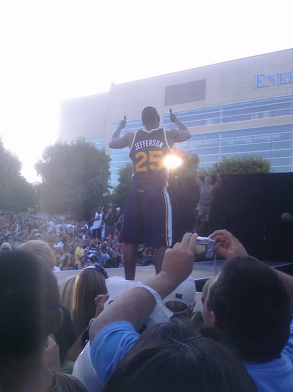
So, what do you all think of the uniforms? I got a few opinions in the other thread, but thought a poll and this thread would make things more concise. I for one am a fan of them. They aren't quite perfect, but I like them a lot better than the blue uniforms. The blues weren't even bad, they were just boring. I like the attempt back at the roots of the old logo.
 
I'm glad we went back to the old note logo. Because it was the Jazz' identity fom day 1. And if you really think about it, the really great sports franchises in this country rarely ever change as drastically, but for minor cosmetic changes. We didn't need a re-brand in 1994. We thought we did, but we really didn't. It took for fans and the team to realize that, now that John and Karl are gone and their trips to hall of fame are finalized, its good to look back, to reminisce, and to appreciate what we've had. What better way to do that than to go back to your roots. I like it. Kudos.
 
I voted that I liked them, but I do think the green numbers on the home unis looks a bit off. I'm sure I'll get used to it.
 
I voted that I liked them, but I do think the green numbers on the home unis looks a bit off. I'm sure I'll get used to it.

I agree. I'm not a huge fan of the white stripe on the roadies either, but the few minuses with them are outweighed by how nice they look to me.
 
Why do people always have to look for flaws in EVERYTHING!!! I personally think that they are aesthetically perfect. I couldn't have done them better myself. IMO, they are the best looking uniforms in the NBA.
 
They are the best uniforms in franchise history and without a doubt the best looking uniforms in the NBA today. I like everything about them, except for Utah on the butt. Don't really see the point of that but whatever. I even like the green numbers on the home white's. The blue roady's are kick *** and I can't wait to get a few of them.
 
Does anyone have a picture of the Utah on the butt of the uniforms. I haven't seen it and am curious. That sounds weird.
 
I like them better than the previous uniforms. I think they should have made the logo either a little bigger or more spread out. It looks too small on the chest. Also the UTAH JAZZ thing on the *** of the shorts is seriously lame.
 
I love the Uniforms although I am disappointed that the word Utah is on the butt of the uniforms. I noticed it while watching the KSL news report when it shows a clip of CJ.
[video]https://www.ksl.com/index.php?nid=304&sid=12029883
 
I'm liking the different color on the number. I can see a lot of other teams start doing this. It's different and at first, I didn't know what to think about it but now I love it.
 
Does anyone have a picture of the Utah on the butt of the uniforms. I haven't seen it and am curious. That sounds weird.

146908278-7d526130bad7ca6fe817df40f7c1a05f.4c69e618-scaled.jpg
 
I noticed that the new Clipper unis also have the logo on the backside. I wonder if this is more of a direction the entire league will be going to or is just it coincidence that the 2 newest uniforms did the same thing?
 
Back
Top