What's new

And here it is...and it's craptacular.

Can you imagine how bad those white jerseys are going to look on that pale *** floor…. People already hate the current floor for how bad it looks on TV and this one looks even worse.

Ryan must have no say with RSL thank god, because the Jazz can’t seem to do anything right.


Sent from my iPhone using Tapatalk
and the more you pray the lighter it gets…

I’m gonna get in trouble with one I think…aaand post
 
Don't mind the jerseys, never liked any of them but the classics blue and white ones.
The filling is all that bother's me.
 
I truly don't understand the yellow and black jerseys. I wouldn't even call them horrible, mostly because they are just so ****ing basic that it's hard to be horrible. I just can't believe someone got paid to design them. I haven't played the NBA2K games in ages, but if they had an option to design a jersey, that's what I would come up with if it was late in the process and I just wanted to hurry the **** up and play the game.
New kid discovers Windows Paint 1.0 beta
 
I truly don't understand the yellow and black jerseys. I wouldn't even call them horrible, mostly because they are just so ****ing basic that it's hard to be horrible. I just can't believe someone got paid to design them. I haven't played the NBA2K games in ages, but if they had an option to design a jersey, that's what I would come up with if it was late in the process and I just wanted to hurry the **** up and play the game.
All Ryan's buddies in Jr. High thought they were dope.
 
I don’t know what’s gonna hurt my eyes more this season the jerseys or watching the jazz try and play defense


Sent from my iPhone using Tapatalk
 
They’re bad. The worst part is they give the notion the franchise began the day he bought it. Like the teams been in Utah 30 years. You don’t rebrand a team that’s been in a place that long like this. The original leaks reaction was so bad they knew they had to throw in the purple mountain jerseys to try and half way save it. How don’t you send out a survey while owning ****ing Qualtrics for fans to tell you this **** sucks before committing years to it? There’s a reason they headlined everything with purple today, because the fanbase hates this totally garbage rebrand. I’ve never had less interest in watching the Jazz. Great job Ryan. Catering to a complete douche and rebranding the franchise in the idea it began the day you bought it. I understood and supported rebranding to solidified 3 colors, but those colors should have been purple,blue, and white, not colors that have no significance with the franchise or fanbase. How do you miss so badly?…..You’re so worried about making Utah cool and yet do this the ****ing year you’re hosting the AS game. Bang up job bro. If the team had been moved and the name had been changed, a full on rebrand like this makes sense. This makes no sense at all.
 
They’re bad. The worst part is they give the notion the franchise began the day he bought it. Like the teams been in Utah 30 years. You don’t rebrand a team that’s been in a place that long like this. The original leaks reaction was so bad they knew they had to throw in the purple mountain jerseys to try and half way save it. How don’t you send out a survey while owning ****ing Qualtrics for fans to tell you this **** sucks before committing years to it? There’s a reason they headlined everything with purple today, because the fanbase hates this totally garbage rebrand. I’ve never had less interest in watching the Jazz. Great job Ryan. Catering to a complete douche and rebranding the franchise in the idea it began the day you bought it. I understood and supported rebranding to solidified 3 colors, but those colors should have been purple,blue, and white, not colors that have no significance with the franchise or fanbase. How do you miss so badly?…..You’re so worried about making Utah cool and yet do this the ****ing year you’re hosting the AS game. Bang up job bro. If the team had been moved and the name had been changed, a full on rebrand like this makes sense. This makes no sense at all.
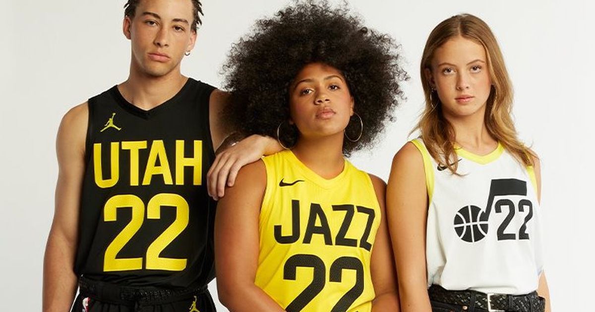
So well said. I hope Ryan learns this is not about him. With the Milers the Jazz were about the community and the state. I have said the same thing to my son about how ironic it is that an owner of Qualtrics would make no attempt to get customer feedback. Why on earth go to bumblebee colors.
 
They’re bad. The worst part is they give the notion the franchise began the day he bought it. Like the teams been in Utah 30 years. You don’t rebrand a team that’s been in a place that long like this. The original leaks reaction was so bad they knew they had to throw in the purple mountain jerseys to try and half way save it. How don’t you send out a survey while owning ****ing Qualtrics for fans to tell you this **** sucks before committing years to it? There’s a reason they headlined everything with purple today, because the fanbase hates this totally garbage rebrand. I’ve never had less interest in watching the Jazz. Great job Ryan. Catering to a complete douche and rebranding the franchise in the idea it began the day you bought it. I understood and supported rebranding to solidified 3 colors, but those colors should have been purple,blue, and white, not colors that have no significance with the franchise or fanbase. How do you miss so badly?…..You’re so worried about making Utah cool and yet do this the ****ing year you’re hosting the AS game. Bang up job bro. If the team had been moved and the name had been changed, a full on rebrand like this makes sense. This makes no sense at all.
Because it's been his dream since Jr high. It is time for that dream to be fulfilled. He's a rich kid with a new toy and he needs to put stickers on it.
 
Because it's been his dream since Jr high. It is time for that dream to be fulfilled. He's a rich kid with a new toy and he needs to put stickers on it.
If this is true (and it is) he loved the same team we all did. The mountains, the purple/blue/white colors and mountains scheme is the Stockton/Malone iconic finals run colors and scheme. Blue and white have always been there. Purple goes all the way back to New Orleans and early Jazz days. How you don’t stick with something that half way represents the franchise we’ve all loved is beyond me. You want 3 solidified colors? There they are. You can make great new schemes from them, and throw back to basically every era of Jazz basketball. Fans aren’t interested in forgetting the franchise that’s existed to this point, and this nonsense yellow/white/black stuff is exactly what it feels like we’re doing. I hoped it was simply fake. And clearly they realize this is not popular. I hope Nike will allow them to repent for their sins and do a proper rebrand, but my lord way to go adding to the confusion of who the franchise is with this hot garbage.

The fanbase isn’t eager to forget Stockton/Malone/Sloan or even the Millers, Hell blue and white were cornerstones of the Boozer/Deron days. And purple/blue/white have been a part of the current years too. Like throwing 3 colors and a rebrand like it’s a team that never existed was the stupidest rebrand approach you could take for a team that’s been in a place for 30 years. At least they seem to have realized it’s hot garbage which is why the J note is purple laced in white and blue mountains in front of the arena as an apology. I won’t buy a single piece of this merchandise. Have fun losing your *** on this one Ryan you deserve it.
 
Last edited:
The purple mountain jersey with “Utah” on it that will be worn an entire season from next season looks great. Seriously how the **** don’t you go with that color and scheme? You could have had an amazing jersey lineup and court, and a solidified identity and instead you throw out trash, get backlash, and have to return a 20 year old purple mountain jersey and release a jersey design for two years away to try and lessen the blow that you ****ed up. They had to release a mountain jersey for the 23-24 season in 2022 to try and pretend like that disgusting black/yellow/white garbage isn’t the real rebrand lol. Disastrous and frankly just embarrassing.
 
So well said. I hope Ryan learns this is not about him. With the Milers the Jazz were about the community and the state. I have said the same thing to my son about how ironic it is that an owner of Qualtrics would make no attempt to get customer feedback. Why on earth go to bumblebee colors.
Ryan owns it. It's 100% about him. There is nothing else it could be about. He had his company handed to him by his dad, this is just another in a long line of things he's owned. It's no different than all his cars or houses or whatever. It's nothing but a toy to him. And it's obvious he's treating it as such. Sad to see a respected org and brand run into the ground.
 
The purple mountain jersey with “Utah” on it that will be worn an entire season from next season looks great. Seriously how the **** don’t you go with that color and scheme? You could have had an amazing jersey lineup and court, and a solidified identity and instead you throw out trash, get backlash, and have to return a 20 year old purple mountain jersey and release a jersey design for two years away to try and lessen the blow that you ****ed up. They had to release a mountain jersey for the 23-24 season in 2022 to try and pretend like that disgusting black/yellow/white garbage isn’t the real rebrand lol. Disastrous and frankly just embarrassing.
The fact that the advertising for the release was "Purple is back" when we were announcing a completely different color scheme is embarrassing.

I think black, white, and yellow could've worked but black/white should've been the primary colors with yellow accents to make it pop.

I also have no idea why they decided to make the font and numbers HUGE.
 
ok, at the risk of being mocked off the edge of sanity, one thing that is bugging me about the current nba's jerseys is that they are all similar safe shades of solid darkish colors, and there isn't that much distinction. the yellow might be kind of odd, but it is a stark change to what everyone else is doing, and i think after a bit i will get used to it, and maybe even like it.
I don't actually disagree with this regarding the NBA doing safe colors and such. I think what bothers me is the team is going look like they're sponsored by Sharpie or something. No effort went into the designs. For the most part, I love the the uni designs from all the eras. Aside from the retro, the new jerseys are just solid colors with a s***** block font.
 
Top