What's new

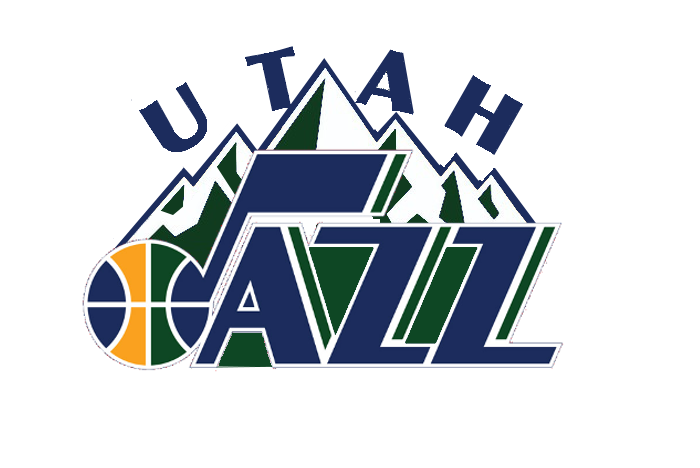
Classic note with Utah or +mountain?

Pick your poison

  • Classic Note

    Votes: 47 82.5%
  • + Mountain

    Votes: 6 10.5%
  • Don't change it!

    Votes: 4 7.0%

  • Total voters
    57
Here's one with more yellow for Stoked.

f583yu.jpg

That is much better imo. What I was thinking was maybe just adding the top outline of the mountains in yellow as well. But this works.

Still like just the Note but I'd be OK with something like this as the logo.

Edit: How do you like my avatar Siro?
 
The added yellow without the mountain backdrop would work. With the mountain backdrop it just looks bad.
 
The added yellow without the mountain backdrop would work. With the mountain backdrop it just looks bad.

I like it as it helps differentiate the logo from the mountains. Draws your eyes to the logo first. However it ends up I think it needed a little more yellow than the previous ones that barely had any.
 
So far we have:

Alt's original:

CK75ofNUMAAEDV5.png


My adjusted logo:

2s5zk7c.jpg


And my yellowfied logo:

f583yu.jpg


I spent a total of less than 15 minutes working on it. I can probably do something more stylish tonight. Maybe. If I felt like it. :p
 
I like the yellow

would be nice to mimic the white stripe from the ball between the yellow and green bands in the AZZ part
 
So far we have:

Alt's original:

CK75ofNUMAAEDV5.png


My adjusted logo:

2s5zk7c.jpg


And my yellowfied logo:

f583yu.jpg


Original without lazy outline

CLBD83DVEAEedi8.png
 
I'm actually pretty surprised there was only 5 votes for + mountain.

It would have been more interesting if you did not include the original note in the vote. I think note + mountains is much better than the current 3D primary logo.
 
Back
Top