
You are using an out of date browser. It may not display this or other websites correctly.
You should upgrade or use an alternative browser.
You should upgrade or use an alternative browser.
New Nike Uniforms: How Bad Are They Going To Look?
- Thread starter Magic Spray
- Start date

Cappy_Smurf
Well-Known Member
Anything is better than the Laker replica trash.
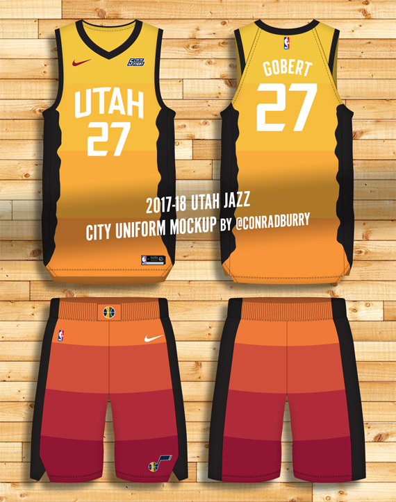
I actually like the idea of a southern Utah theme instead of the mountain theme. When they were talking about an orange gradient, I had no idea it was based on the parks of southern Utah. At least it makes sense now. Great idea, but probably going to be hard to pull off.
Anyway, I kinda hope most people hate them. I tend to like stuff more when everybody else hates it.
fishonjazz
Well-Known Member
Contributor
2018 Award Winner
2019 Award Winner
20-21 Award Winner
2022 Award Winner
2023 Award Winner
2024 Award Winner
2025 Award Winner
Bill Murray feels the same as I do about those
I thought the Gold unis were ugly off his mock-up too. These are just him designing these things based on what a guy told him they looked like from memory iirc, so they aren't 100% accurate. Hopefully he missed some big detail that brings teh uniform together. I really hope it's a gradient color change and not just blocked sections.
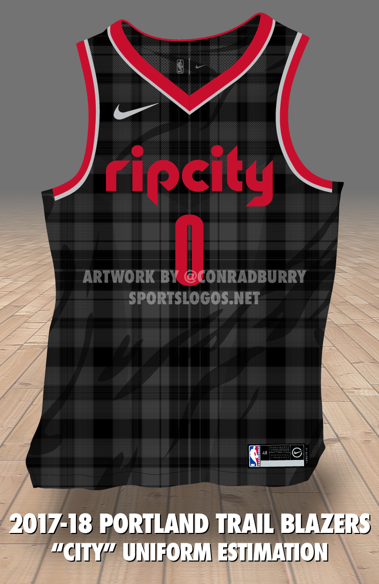
At least we dont have a flannel patter on our jerseys.
nateboz
Well-Known Member
As someone who runs a business. Why on earth would they make a jersey that wouldn't sell? That's marketing 101. Make a product someone wants to buy. The designers for Nike need to make that a priority. They are trying to turn the NBA into the Oregon ducks.
Sent from my SM-N950U using Tapatalk
Sent from my SM-N950U using Tapatalk
LifeOnaPlate
Well-Known Member
If this is true, these are the ugliest Jazz unis of all time. And it's not even close. Lol
LifeOnaPlate
Well-Known Member
The "candycorn peed-your-shorts" look, I see.