
NAOS
Well-Known Member
u sooo rude!!!1!!Lol at anyone thinking this isn't already set in stone
u sooo rude!!!1!!Lol at anyone thinking this isn't already set in stone
rude!Lol at anyone thinking this isn't already set in stone
Most of those are boring AF.So we came 21st overall according to the Yahoo! ranking.
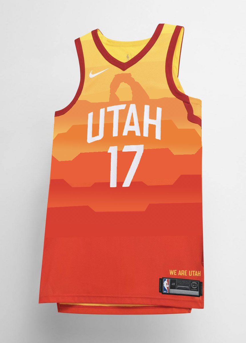
I think that's about right. It was a bold choice but I'm still not sure how it'll look on the court. I get what they're trying to do and represent the state and all but it looks too 'rainbowy' to be for a basketball jersey. Also has that try hard feel and not effortless.
https://sports.yahoo.com/nike-city-uniforms-ranked-worst-best-183058593.html
I like most of the jerseys. I definitely prefer the ones like Utah who went bold and tried to do something unique, even if they came up short.
This is like the day after the super bowl when everyone is suddenly Don ****ing Draper when it comes to ads.Here's some more commentary.
https://www.theringer.com/nba/2017/12/27/16823246/nike-city-uniforms-jersey
The consensus seems to be that they like the bold choice of theme and colour of the Jazz jersey, but just not sure about the execution of it.
This is like the day after the super bowl when everyone is suddenly Don ****ing Draper when it comes to ads.
oh what's that? you're not an advertising executive? But I thought you were just telling me why the Geico ads were so poorly done.
If people were legit designers they would be designers, not internet commenters.
Someone made this mock on Twitter... looks way better than the actual one IMO.