You are using an out of date browser. It may not display this or other websites correctly.
You should upgrade or use an alternative browser.
You should upgrade or use an alternative browser.
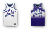
Reminder- Jazz are getting new unis next year. . .
- Thread starter framer
- Start date
YoungJefe
Well-Known Member
The round part of the note should be the shape of a basketball... because it's a basketball. That's like the whole thing.

framer
Well-Known Member
I think those are phasing out. We aren't carrying 5 combos I don't think. I'd guess the yellow jerseys get put away first. I actually kinda have grown to like the black ones.We're still stuck with the ugly black, white and yellow ones for now, right? I'm pretty sure these ones just replace the purple mountain jerseys.
framer
Well-Known Member
Hell, now I want THIS jersey instead.
YoungJefe
Well-Known Member
The note is the same, lol. It's paying homage to that era.Hell, now I want THIS jersey instead.
framer
Well-Known Member
The note is the same, lol. It's paying homage to that era.
I know, but that Mardi Gras piping is awesome.
edit- The new jersey has it too, it is just more difficult to see.
The Fresh Prince
Well-Known Member
It's the original noteNeeds a better note.
Quarter notes are pretty good.Needs a better note.
YoungJefe
Well-Known Member
Udidthizz
Well-Known Member
That weak note just looks bad. I know it harks back to the note used by the NO Jazz in their first season, but there's a reason they changed it almost immediately after to the note that's still used today. The Jazz note is an awesome logo, no need to use it's lame predecessor just because it's 'retro'.
framer
Well-Known Member
It's the 50th anniversary of that uni. I'm OK with it.That weak note just looks bad. I know it harks back to the note used by the NO Jazz in their first season, but there's a reason they changed it almost immediately after to the note that's still used today. The Jazz note is an awesome logo, no need to use it's lame predecessor just because it's 'retro'.

