Zion straight up for "Jazz"? The Pelicans just might take it now.I would be fine trading the Jazz name. I dont really care about it that much, but only our team got major compensation. Like lots of future picks or a player that would make a huge difference.
If these are actually our Jerseys they are pretty bad. If they are for a few games, then its fine. If its our man jerseys, that is stupid.
You are using an out of date browser. It may not display this or other websites correctly.
You should upgrade or use an alternative browser.
You should upgrade or use an alternative browser.
New black and white color scheme
- Thread starter Jingled
- Start date
I can’t even count how many fan-made jerseys are so much better than things that those paid to do this for a living have come up with. But this shouldn’t be. I hear those ascending into prominence amongst sports world elites wipe their asses with magical toilet paper that isn’t available to us peons.
Handlogten's Heros
Well-Known Member
2019 Award Winner
20-21 Award Winner
2022 Award Winner
2023 Award Winner
2024 Award Winner
2025 Award Winner
2025 Prediction Contest Winner
I can’t even count how many fan-made jerseys are so much better than things that those paid to do this for a living have come up with. But this shouldn’t be. I hear those ascending into prominence amongst sports world elites wipe their asses with magical toilet paper that isn’t available to us peons.
Counterpoint - The black and yellow jerseys will allow us to use the song “Black and Yellow” and it will be a dope 20 second commercial.
This is why you aren’t as good as the pros… lolz.
JazzJunkie
Well-Known Member
Feels like he's trying to align the colors with the Bees. Any of yall feel like he may try to change the name in the next few years?This.
I still think it harkens back to when Ryan was in Jr. High and doodling on his spiral notebook cover, dreaming about the day he would own the Jazz and drawing all kinds of "updated" jerseys and logos, which were all drawn in black pen on his yellow and white spiral notebook cover. His Jr. High school friends loved it and praised him for it, so futuristic, so avantgarde, you know, for a jr high kid with no real artistic ability, and when he finally bought the team, he opened the bottom drawer of his desk and pulled out an old notebook, dusted it off, and looked lovingly at the logos and jerseys his 12-year-old self envisioned, Black with white, black with yellow, even black with yellow and white where the white and yellow swirls overlapped, and said to no one in particular "finally".
JazzJunkie
Well-Known Member
Lol don't answer that I could have just read back a few posts. But alas...
LogGrad98
Well-Known Member
Contributor
20-21 Award Winner
2022 Award Winner
2023 Award Winner
2024 Award Winner
I can’t even count how many fan-made jerseys are so much better than things that those paid to do this for a living have come up with. But this shouldn’t be. I hear those ascending into prominence amongst sports world elites wipe their asses with magical toilet paper that isn’t available to us peons.
I like the icon and the association. The others, not so much.
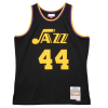
Seriously for my money the best jerseys we have ever had are the dark mode "city edition" jerseys from last year. Those should be permanent staples. I just wish I had gotten my hands on one for Ingles and Mitchell in the dark mode, in addition to my Gobert jersey.

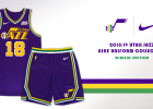
I am also a fan of some of the throwback jerseys, especially the purple ones.
And frankly I like the current white jerseys, classy understated, professional. Just enough of our classic color pallet to pop. Nice.

I am not a fan of the stark industrial look of the black and white jerseys. Adding yellow doesn't do much to improve on it. Here is a mockup I found. Not sure where the yellow is coming from but I guess it is just one of Ryan's favorite colors. Thank god his favorite colors aren't neon orange and baby puke green.
Funny how polarizing the uniform can be.
Last edited:
LogGrad98
Well-Known Member
Contributor
20-21 Award Winner
2022 Award Winner
2023 Award Winner
2024 Award Winner
I like the icon and the association. The others, not so much.
Seriously for my money the best jerseys we have ever had are the dark mode "city edition" jerseys from last year. Those should be permanent staples. I just wish I had gotten my hands on one for Ingles and Mitchell in the dark mode, in addition to my Gobert jersey.
View attachment 11769
I am also a fan of some of the throwback jerseys, especially the purple ones.
View attachment 11767
And frankly I like the current white jerseys, classy understated, professional. Just enough of our classic color pallet to pop. Nice.
View attachment 11768
I am not a fan of the stark industrial look of the black and white jerseys. Adding yellow doesn't do much to improve on it. Here is a mockup I found. Not sure where the yellow is coming from but I guess it is just one of Ryan's favorite colors. Thank god his favorite colors aren't neon orange and baby puke green.
Funny how polarizing the uniform can be.
If it were up to me, I’d do four jerseys. I’d do the first two you posted, but then on the white jerseys I’d do the traditional home jersey.
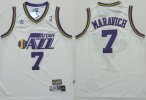
And then I’d do this fan-created alternate:

LoPo
Well-Known Member
I like the icon and the association. The others, not so much.
Seriously for my money the best jerseys we have ever had are the dark mode "city edition" jerseys from last year. Those should be permanent staples. I just wish I had gotten my hands on one for Ingles and Mitchell in the dark mode, in addition to my Gobert jersey.
View attachment 11769
I am also a fan of some of the throwback jerseys, especially the purple ones.
View attachment 11767
And frankly I like the current white jerseys, classy understated, professional. Just enough of our classic color pallet to pop. Nice.
View attachment 11768
I am not a fan of the stark industrial look of the black and white jerseys. Adding yellow doesn't do much to improve on it. Here is a mockup I found. Not sure where the yellow is coming from but I guess it is just one of Ryan's favorite colors. Thank god his favorite colors aren't neon orange and baby puke green.
Funny how polarizing the uniform can be.
Those aren't the worst jerseys. I'm not big on the numbers, but I don't really mind them.
LogGrad98
Well-Known Member
Contributor
20-21 Award Winner
2022 Award Winner
2023 Award Winner
2024 Award Winner
I like the white ones too. Not too big on the gray scale though. Looks ok.If it were up to me, I’d do four jerseys. I’d do the first two you posted, but then on the white jerseys I’d do the traditional home jersey.
View attachment 11771
And then I’d do this fan-created alternate:
View attachment 11772
This is kind of a cool idea to have the music lines as part of the jersey. I like the Jazz one better than the Utah one.
This is kind of a cool idea to have the music lines as part of the jersey. I like the Jazz one better than the Utah one.
This is great. Now just have the sheet music be “In the Air Tonight.”
