What's new

New Nike Uniforms: How Bad Are They Going To Look?

Anyone else noticed that the shorts, after the first 2 strip of colours the tone changed significantly from the 3rd, 4th, 5th shades of colour?


Anyone else wonder why that is? Could they not have made the gradient change more gradual?


Maybe the 2nd strip could have been a bit darker and the 3rd strip slightly darker to make the gradient more gradual?


DR_8F5ZVAAAglES.jpg

The gradient is pretty consistent if you tuck in the shirt.
 
The gradient is pretty consistent if you tuck in the shirt.

I'm not talking about the jersey - the gradient on that is fine. I'm talking about the shorts.. have a look from the belt down, the first 2 bands are fine, but see how the 3rd band there is a significant change in the gradient (i.e., a lot darker)? Not sure if that was intentional but it does seem strange how it got significantly darker from the 3rd band onwards.
 
I personally dig this uniform. It's original and unlike any other uniform in the league. Kudos for thinking outside of the box.
 
none of this is official until tomorrow, bro. So, be cool... it could all turn out to be the purple mountain jerseys. Based on the quotes from the pres, the whole organization seems to love those old purple mountain jerseys just like you.

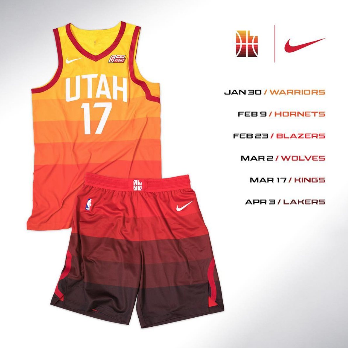
Lol at anyone thinking this isn't already set in stone
 
Anyone else noticed that the shorts, after the first 2 strip of colours the tone changed significantly from the 3rd, 4th, 5th shades of colour?


Anyone else wonder why that is? Could they not have made the gradient change more gradual?


Maybe the 2nd strip could have been a bit darker and the 3rd strip slightly darker to make the gradient more gradual?


DR_8F5ZVAAAglES.jpg
They literally used the precise gradient change of colors in the shorts and onto the Jerseys.
 
Back
Top