gomretat
Well-Known Member
The note was one of the best logo's in all of professional sports. Sad to see it take a back seat.All the Jazz gear I own is just the note. I don't think I'll be buying any mountain Jazz gear.
The note was one of the best logo's in all of professional sports. Sad to see it take a back seat.All the Jazz gear I own is just the note. I don't think I'll be buying any mountain Jazz gear.
Living outside of Utah, most people have no idea what the note means. It's kind of nice to be able to wear Jazz gear and not have too many strangers try to start a conversation about what I'm wearing. And those who do actually know the NBA so it's OK.The note was one of the best logo's in all of professional sports. Sad to see it take a back seat.
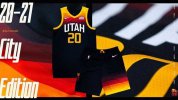
I’m just happy they retired the stupid neon branding. I definitely wish they still had the gradient City versions though. That might’ve been one of best jerseys/court that they’ve ever done.
AgreedI personally love these jerseys and think they are the best ones we’ve had in years
Sent from my iPhone using Tapatalk
Was it accompanied by "****er"?Interesting that the language filter censors the word 'squirrel'.
This. It could been been incorporated into this new jersey design.Bring back the note!
The dark mode ones or whatever they called them were the absolute best we've had in forever. I wish they would bring these back.I’m just happy they retired the stupid neon branding. I definitely wish they still had the gradient City versions though. That might’ve been one of best jerseys/court that they’ve ever done.


