
You are using an out of date browser. It may not display this or other websites correctly.
You should upgrade or use an alternative browser.
You should upgrade or use an alternative browser.
New Uniforms, Court & Logo (Pictures Inside)
- Thread starter MrMojoRisin
- Start date
D
Deleted member 848
Guest
The one on the right could have been designed by a four year old.
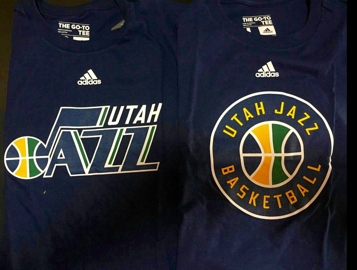
honestly laughable. Did Gail just ask one of her grandkids to design it? I feel like designers across the country are cringing.
Miggs
Well-Known Member
They could have done much, much better... They could have given the letters a more dynamic look at least, the current logo just seems a bit plain.
The current logo but in the following style would have been pretty sweet imo.

Don't take this the wrong way but...are you straight?
Jamezz
Well-Known Member
Don't take this the wrong way but...are you straight?
100%
I said the same logo but in that 3D style. It's just an example that happened to have the fruity colors. Geez one has to explain everything...
fishonjazz
Well-Known Member
Contributor
2018 Award Winner
2019 Award Winner
20-21 Award Winner
2022 Award Winner
2023 Award Winner
2024 Award Winner
2025 Award Winner
Hell yaShould have gone green. I knew they wouldn't but still

fishonjazz
Well-Known Member
Contributor
2018 Award Winner
2019 Award Winner
20-21 Award Winner
2022 Award Winner
2023 Award Winner
2024 Award Winner
2025 Award Winner
That would be pretty cool.Willing to bet they update the court to include the secondary logo as our new center court logo, ala the old Salt Palace court.
View attachment 4797
NAOS
Well-Known Member
They could have done much, much better... They could have given the letters a more dynamic look at least, the current logo just seems a bit plain.
The current logo but in the following style would have been pretty sweet imo.
pretty much confirms everything else I was curious to know about you.
What kind of hair stuff do you use? Do you call it "product"?
Tea tree shaping cream. Yes. Do you call it stuff?