
You are using an out of date browser. It may not display this or other websites correctly.
You should upgrade or use an alternative browser.
You should upgrade or use an alternative browser.
New Uniforms, Court & Logo (Pictures Inside)
- Thread starter MrMojoRisin
- Start date
spycam1
Well-Known Member
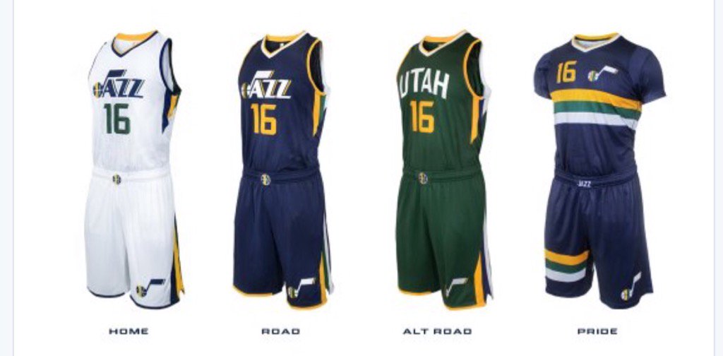
The "UTAH" on the green is dope.
Hopefully it grows on me.
I really love the green Alt's (hold the weird arch in Utah.) I hated the previous green Alt's because of the blue bordering and stripe on the sides. It just didn't look right. But that issue has been fixed with these new ones. Now the green pops much more and doesn't look so drab. The only thing that would make it better is if the "UTAH" wasn't arched or if it was replaced with either the Primary logo or the wordmark that's on the Home and Road Uni's.

I think I'm gonna get one.
Sorry to get off track for a moment... but where did the Jazz play that night? Doesn't look like a very big arena.
D
Deleted member 848
Guest
Sorry to get off track for a moment... but where did the Jazz play that night? Doesn't look like a very big arena.
There's Japanese katakana underneath the JAS sign.....
Good eye. Bizarre.
Utah is just an ugly looking word.Hopefully it grows on me.
Sent from my A0001 using Tapatalk
spycam1
Well-Known Member
Sorry to get off track for a moment... but where did the Jazz play that night? Doesn't look like a very big arena.
There's Japanese katakana underneath the JAS sign.....
Good eye. Bizarre.

♪alt13
Well-Known Member
Super surprised that these are as good as they are. LOVE IT
My one complaint, as others have said, is the arched font on the UTAH jersey. It looks like an afterthought. They could have done better.
The tri-color ball returning to center court is awesome. The sleeved jerseys are easily my favorite.
My one complaint, as others have said, is the arched font on the UTAH jersey. It looks like an afterthought. They could have done better.
The tri-color ball returning to center court is awesome. The sleeved jerseys are easily my favorite.
this. They went full retro/minimalist on em and I ****ing dig it.
The green alternate is **** but I'm really digging the rest.
BOOOOOOOOO
NAOS
Well-Known Member
Utah is just an ugly looking word.
Sent from my A0001 using Tapatalk
completely the opposite from the truth.
fargon_sneaky_bastage
Well-Known Member
I'm a huge fan of their current color scheme and primary logos. Pretty difficult to simultaneously throw back to your origin and maintain some distance all while being unique from the other 29 teams and their colors.
fishonjazz
Well-Known Member
Contributor
2018 Award Winner
2019 Award Winner
20-21 Award Winner
2022 Award Winner
2023 Award Winner
2024 Award Winner
2025 Award Winner
Agreed.Fresh AF, my dudes.
Gotta me one of them white ones.
Darkwing Duck
Well-Known Member
There's Japanese katakana underneath the JAS sign.....
Good eye. Bizarre.
Jazz and Suns played two regular season games in Tokyo in 1990.
♪alt13
Well-Known Member
I'm a huge fan of their current color scheme and primary logos. Pretty difficult to simultaneously throw back to your origin and maintain some distance all while being unique from the other 29 teams and their colors.
Police still looking for kidnapping suspects; abandoned vehicle found
https://www.ksl.com/?sid=39732861&nid=148&title=police-still-looking-for-kidnapping-suspects-abandoned-vehicle-found

Agreed.
Gotta me one of them white ones.
Mean green for me, gotta represent on these Brooklyn streets. Dummies here wearing Nets hats like I don't even know why.
fishonjazz
Well-Known Member
Contributor
2018 Award Winner
2019 Award Winner
20-21 Award Winner
2022 Award Winner
2023 Award Winner
2024 Award Winner
2025 Award Winner
Wtf
Police still looking for kidnapping suspects; abandoned vehicle found
https://www.ksl.com/?sid=39732861&nid=148&title=police-still-looking-for-kidnapping-suspects-abandoned-vehicle-found

zyzz
Well-Known Member
Uni-watch guy likes them
https://espn.go.com/nba/story/_/id/15519329/uni-watch-breaks-new-look-utah-jazz-bringing-next-season
I like the sleeved jersey way more than I thought I would, especially the connection to the old warmups. I think they're the most creative sleeved jersey in the league. Most of the other ones just look really plain like a t-shirt with a giant logo in the center, so I'm glad the Jazz went all out on theirs.