What's new

Rebrand announcement coming next week

I’m reserving judgment until the new branding is confirmed. However, I will say that I’m very worried about the future of this franchise right now.

Even if they do turn out to be hideous and pathetic and a total disaster the jerseys will still be the least of the Jazz problems right now.


Sent from my iPhone using Tapatalk
 
I'm going to be under the impression that this is just fluff and that we get surprised with some dope *** jerseys. Hope I'm right!
Well, that would be a masterful attempt at lowering expectations. Kinda needed after the city jerseys, too.
 
View attachment 12205
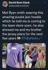
So this was the tweet I was referencing in my last post.

To me, this seems like pretty rock solid evidence that purple is a pretty large part of the rebrand- which is a huge sigh of relief. That purple seems like a much lighter shade than what we’ve used in the past, and I gotta say, I’m really digging it.

Tinfoil hat time: Unless the black and yellow uni’s will be used for summer league, I believe that initially, they were the planned rebrand until images leaked earlier this year and the entire fanbase lost their collective ****. Ryan Smith strikes me as a dude that would be paying attention to our reaction and once he saw how universally hated they were, he immediately scrapped the idea and went in a different direction. I also wouldn’t be surprised one bit if Ryan signed off on leaking the images so he could find out how they’d be received. If so, he certainly got a definitive answer.
Later on in the Twitter thread, the guy said Ryan told them that the purple mountain jerseys are coming in like 2 years. And that hoodie has been on the online store for a while. He said he saw the black and yellow jerseys and that they aren’t exactly like the renderings, but close. So they are indeed coming.
 
Later on in the Twitter thread, the guy said Ryan told them that the purple mountain jerseys are coming in like 2 years. And that hoodie has been on the online store for a while. He said he saw the black and yellow jerseys and that they aren’t exactly like the renderings, but close. So they are indeed coming.
Look I'm on an Island here... but I like them... do I like them aesthetically... nah they ugly AF. I like them because they are genuine. If we are gonna act like a trash organization we should be genuine and transparent and also look like trash. Its consistent and I respect that.
 
Look I'm on an Island here... but I like them... do I like them aesthetically... nah they ugly AF. I like them because they are genuine. If we are gonna act like a trash organization we should be genuine and transparent and also look like trash. Its consistent and I respect that.
#taketrashout
 
Seriously, I don't mind the first one. But the other two, it just feels like a few people got paid to come up with an idea that took two minutes to make.

"How about gold with black lettering, then bleach with gold lettering! One can say "Jazz" and the other day say "Utah"! Ok, we; sure earned our six figure consulting fee."
I agree sort of. I am just not crazy at all about the color scheme. The first one at least looks complete. The other two are generic and half-baked.
 
Each jersey has 2 simple colors on it and the only thing the color is really used for is basic block text. The most exciting design element is a jazz note on one of the three jerseys.

These jerseys would translate well to an NES game.
 
Each jersey has 2 simple colors on it and the only thing the color is really used for is basic block text. The most exciting design element is a jazz note on one of the three jerseys.

These jerseys would translate well to an NES game.

8-bit graphics may be a bit too sophisticated.
 
Awful. Just awful. Is it bad if a jersey change/rebrand kills interest in me watching the team? Like it just turns me off from following the team in any way
 
Seriously, I don't mind the first one. But the other two, it just feels like a few people got paid to come up with an idea that took two minutes to make.

"How about gold with black lettering, then bleach with gold lettering! One can say "Jazz" and the other day say "Utah"! Ok, we; sure earned our six figure consulting fee."

If it were gold, it might work. It'd be kind of like the New Orleans Saints. But this is highlighter yellow.
 
Top